Set a decade before the events of the original 1960s Star Trek series, Star Trek: Discovery launched in 2017. Working with Prologue, Francisco Sánchez de Cañete was asked to art direct the title sequence for the new series.
Fran, how did you get into motion design and the VFX industry?
I'm a Spanish Art Director based in LA, focused on 3D art and design with a strong background in fine arts. I was actually a painter when I started playing around with 3D to enhance the pictoric experience, back in 2004. Five years later and after an intense self-thought period, I opened a Motion Graphics studio in Sevilla, OUIEAcrea with some friends. In 2011, I moved to Berlin and started working for the advertisement and car industry.
Finally six years later, I moved to LA where I focused on the main title industry while producing an ambitious sci-fi short film about Federico Garcia Lorca with my wife and partner Marta Figueredo. I love the VFX and creative sector of LA, especially because I'm freelancing and that got me into studios like Prologue, The Mill, Elastic, DEVA, Buck and MOCEAN. All of them with different approaches to the creative process, that constant shifting from one place to another keeps me evolving.
Can you tell us about your role in creating the titles for Star Trek: Discovery and how the sequence had progressed from previous Star Trek titles?
My role in this project was Art Director and I put in motion the beautiful designs of Ana Criado. I created the 3D animations, designed a few shots from the original storyboard, and the part I most enjoy, the R&D of the motion and the style of integration of 2D and 3D.
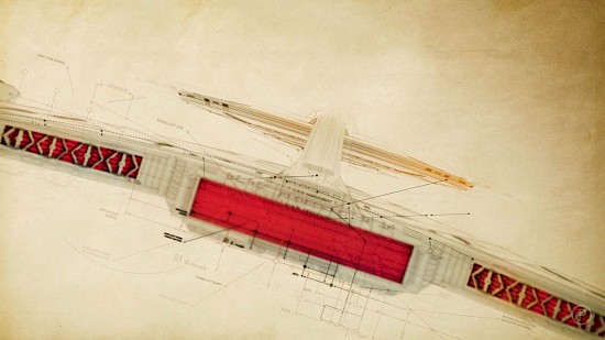
The retro style of the titles was a superb exercise of design by Ana Criado. She avoided the high-tech approach, instead focussing on a nostalgic and more vintage look.
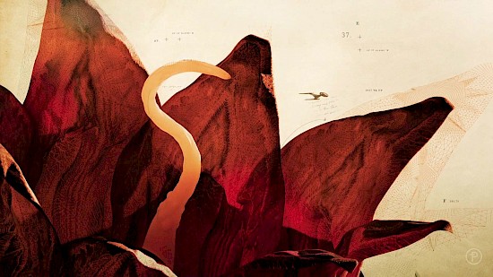
We heard that influence for the title graphics had been taken from Leonardo DaVinci’s notebook. Can you tell us how that came to be and why this idea shaped the sequence?
The blueprint concept allowed us to work through the idea of the 'second renaissance' in a very direct way. Through this concept, the main titles could metaphorically hit on every major scientific breakthrough and exploratory milestone that had happened in Trek canon up until the beginning of the show, and at the same time transfigure the tenets central to Kirk’s famous mission statement into something the viewer could actually see. Christian Antolin designed all the beautiful handwritten annotations and drawing lines, while Nader Husseini who co-art directed the project on the 2D side, was in charge of giving life to the blueprint scaffolds.
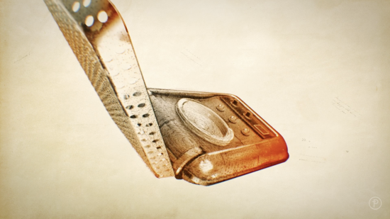
Could you tell us how you used X-Particles to create the ‘dissolving intercom' shot and explain the significance of this scene?
The dissolve effect of the intercom was a metaphor to link the concept of the first attempt of the ship’s crew to dominate the technology of teletransportation. I decided to use X-Particles in this particular shot because of the flexibility it offers to simulate and handle multiple caches of an animation, and of course, there was a lot of experimentation as I didn't want it to look sand-like. I ended up mixing the X-Particles infallible Explode effector in addition to the C4D PolyFX to drive the deformation of the intercom and warp it before dissolving the particles away.
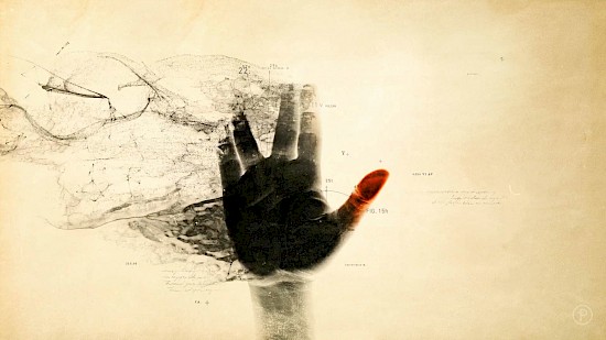
Now, you don’t need to be a Star Trek fanatic to be familiar with the Vulcan gesture! How was this shot created and why did you choose to use X-Particles for the desired effect?
That's my hand right there! The only 3D involved was the particle simulation. I created three different particle streams rendered separately and comped back together in AE. We wanted to reflect the pass of time and the Vulcanian heritage of the protagonist (half human/half Vulcanian). I chose X-Particles for the ability to emit particles from different sources like splines and animated textures. This came very handy in creating the right particle streams from the hand shape.
If there was one piece of advice you would give to young, aspiring motion designers what would it be?
My humble advice would be to get inspiration out of the boundaries of the VFX industry; travel; read and go to art exhibitions and curate your own inspiration sources. Get out of your comfort zone and emigrate at least once in your lifetime, this will enrich not just your skills but your perspective of what the VFX industry is.
And lastly, what is your favourite feature of X-Particles?
I have a few: StrangeAttractors and Infectio are great because you get a high level of complexity within a few clicks. The one I have been using the most recently is the FlowField, it gives you that extra visual control over the particles versus the traditional turbulence.
Studio: Prologue
Creative Director/Designer: Ana Criado
Creative Director/Producer: Kyle Cooper
Design: Ana Criado, Christian Antolin and Fernando Domínguez Cózar
Animation and Art Direction: Francisco Sánchez de Cañete and Nader Husseini
Editor: Rachel Fowler
Writer/Historian: Kurt Mattila
3D Support: Rodrigo Lescano
Music: Jeff Russo